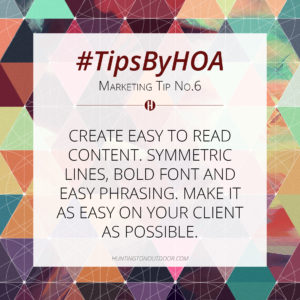
Create Easy To Read Content
In a world of volume, noise, and distractions, make your advertising content simple, eye pleasing and bold. We have all seen poorly designed billboard vinyls, TV ads, websites and business cards, they are distracting and they also make your company look bad. Remember that when it comes to advertising, less content means a bigger and better impact on consumers.
Message
Your message should be 10 – 12 words or less, with no more than 5 – 6 words in the headline. Your message is the most important part of the design. It can be a phrase, a call to action, or a tagline that catches your potential customers attention and moves them to action. Use short words. Details, such as phone number, website, and location are important, but, use as few as possible.
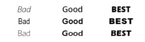
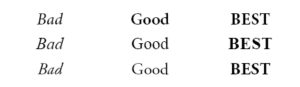
Fonts
THINK BIG AND BOLD! Don’t use thin fonts or script fonts. The strokes of the characters of these fonts are too thin to be seen from any distance. Use heavy, bold, LARGE fonts to maximize readability. The bold option is an excellent way to add weight and emphasis to your wording.
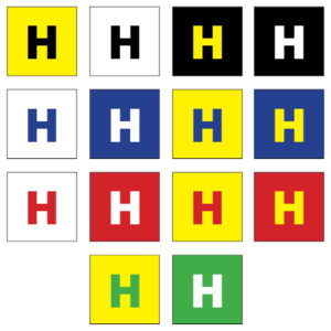
Colors
High color contrast is a key ingredient. Just like using large text, the right color combination can make your message readable from a much longer distance. Refer to the samples on this page for some of the best text color vs background color combination.
The best billboard designs are simple, bold, creative and often funny. Billboard design is best used for branding purposes to help create top of the mind awareness.
Poor Color Contrast Good Color Contrast

Images
Choose an image that generates the strongest emotion related to your product or service. An image of people having a fun time will get more attention from viewers than just a picture of your product. The viewer will be more stimulated by the feel and experience of what the image portrays. Images need to be high quality and high resolution. Images are increased greatly in size and will pixelate if the resolution is too low. Your logo or business name should be very readable on the sign. A great message will be lost if no one knows who is delivering the message.
Make it SIMPLE. Make it BOLD. Make it MEMORABLE